
MPN Studio is a company specializing in architectural visualizations, founded by my friend Mateusz. My task for this project was to create a visual identity and website aligned with the studio’s future development plans and designed to support its business goals.
To build an effective visual identity and website, we began by defining the brand strategy. Among other things, we established that the company’s main target group consists of small architecture studios seeking long-term partnerships for creating visualizations of their designs. We also defined that the central motivation behind MPN Studio’s work is the satisfaction derived from supporting its clients’ businesses.
The brand strategy became a key point of reference for all design decisions in the later stages of the project, ensuring consistency in shaping the company’s image.
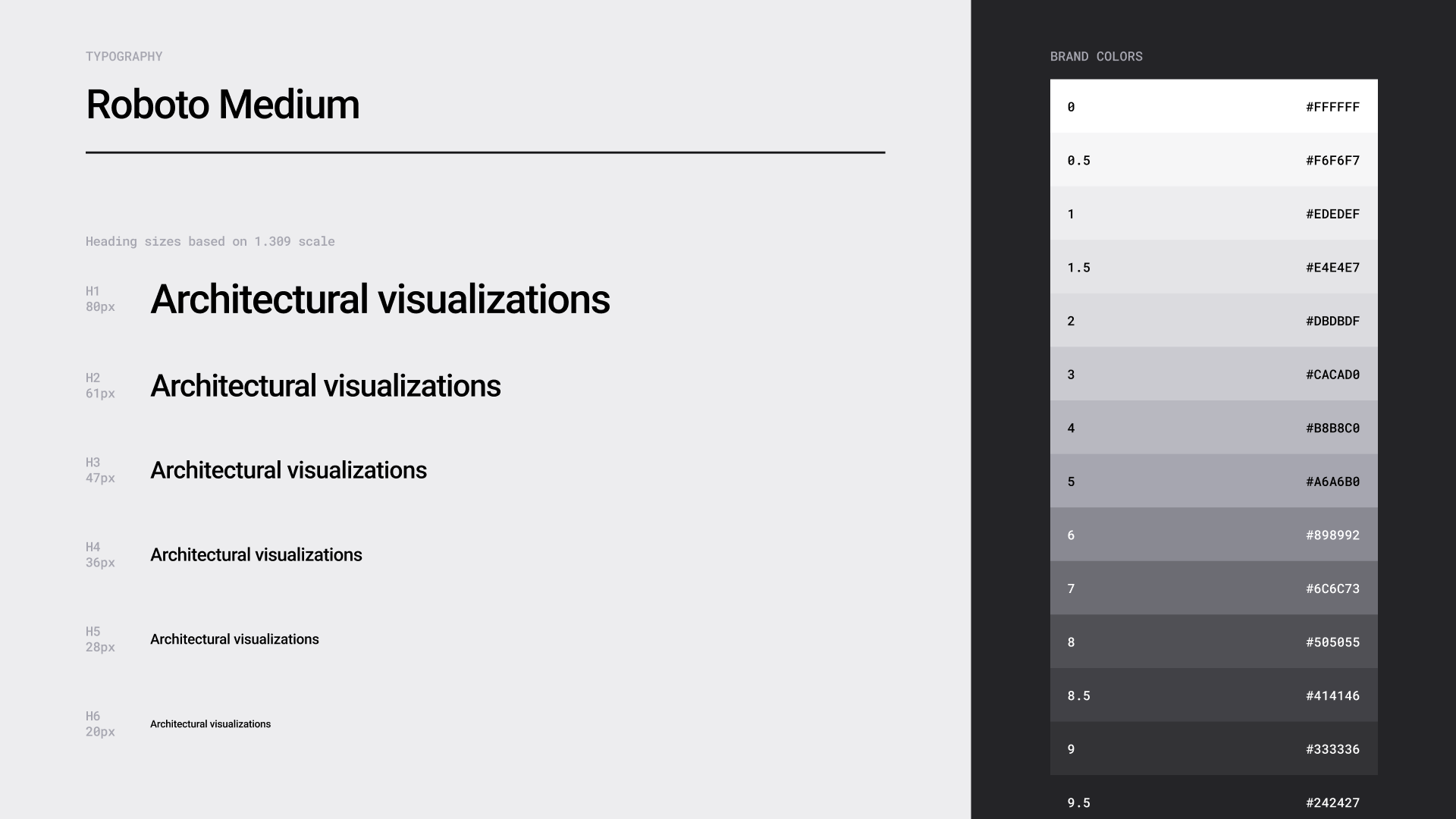
I designed the visual identity with the intention of creating a style suited to the architectural industry and capable of clearly communicating the brand’s personality. This helps MPN Studio reach the right target audience while supporting a professional and trustworthy image. At the same time, distinctive elements were incorporated to set the company apart from competitors and attract the attention of potential clients.
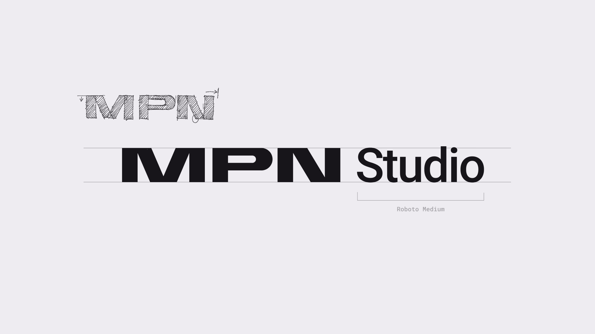
Just like a crystal ball, MPN Studio helps visualize the future. We incorporated this symbolic motif into the visual identity, supporting the creation of a distinctive brand image.

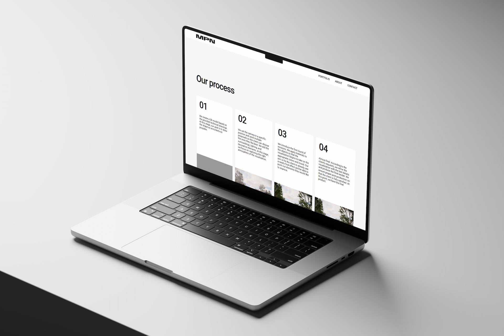
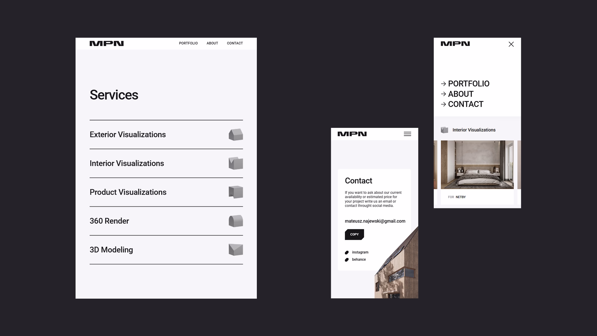
The main goal of the website design was to present MPN Studio’s completed projects in an appealing way and to encourage new clients — particularly those seeking ongoing collaboration for creating 3D visualizations — to get in touch.
An example of how the brand strategy informed the final website design is the use of labels placed on each visualization. These labels indicate the author of the architectural project and invite visitors to explore their work. This reflects MPN Studio’s core ambition: the desire to support the businesses of its clients.
This comprehensive project enabled MPN Studio to build a professional and trustworthy brand image from the very start of its operations—an image aligned with the brand strategy and the company’s long-term development plans. I carried out all stages of the project, including the website development, which allowed the client to move through the process smoothly and without unnecessary complications.
I would like to thank Mateusz for his engagement throughout the process and for trusting me with this project. I wish you continued success as you grow your business.